
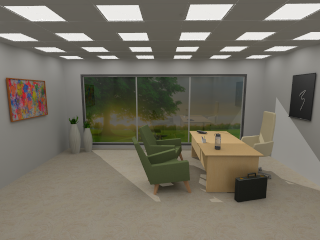
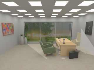
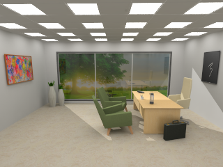
Configura automatically renders and saves HDR (High Dynamic Range) images in the .exr format alongside regular .png images, to enable editing in Configura or in 3rd party photo editing software. Post processing is great for correcting or enhancing a rendering, or for adding special effects. If you have a rendering that you're not quite happy with, try working with the post processing options as a first step before re-rendering. Original rendering too dark? Try brighten it up a bit! Post processing can be a real time saver!
The post processing area of the Render Queue window is divided into the following sections: Filter, Tone mapping, Brightness / Contrast, Effects, Intensity curve, White balance, and Hue / Saturation. Every section has a reset button that will reset all the controls within the section to their default, and there is also a back arrow button that resets each control individually. If a post processing is changed from default, the section name turns blue and displays a *, so you can easily spot where any changes have been made.
When an image has finished rendering and the progress bar is green, you can start with the post processing. To apply a post processing effect, click and move a slider sideways, or type in a value in the input field and press Enter. All changes are instant and are temporarily saved in the .png file in the image folder. If you want to keep the edited image, remember to save the .png file manually to a different location, since the file in the Render Queue folder will be overwritten the next time you apply post processing.
We encourage you to try these settings out, but please note that tweaking the controls just slightly could have quite a significant impact on your image.
Similar to photo apps in smartphones, you can modify images by applying Filters in Configura. They are a quick way to tweak light and color tones, and if you don't like the result, you can always pick Original to reset all filters and revert back to your original image.
You can create and save your own filter as a preset, either entirely from scratch, or based on an existing filter that you want to adjust. To save a filter, follow these steps:
Keep the Default option in the Filter list, or pick a filter that you want to start from.
Click the + button and enter a filter name. Confirm with OK.
Use the different post processing controls available to make adjustments. Clicking a reset button will revert the value back to what it previously was; not necessarily to zero.
Click the Save button to save your filter and make it available in the Filter list. It can now be applied to your renderings.
To remove a filter, select it in the list and click the red removal X.
After selecting a Filter that you like, you can go in and edit the image even more with the other post processing options in the Render Queue.
Tone mapping compresses the color range in an image into a range that can be handled by computer monitors. Configura offers three options that will affect your image differently. Describing exactly how is difficult, so we recommend that you try them out yourself and compare the results. Remember to look at the overall image as well as the details (for example lit surfaces).
|
Limited: the Limited option lies very close to the original image. This method limits the color range by cutting out the darkest and the brightest colors. It does not actually correct anything; under exposed areas will remain dark, and over exposed areas will remain bright.
|
|
Photographic: this option uses more color shades and most of the times generates a good result. It corrects under and over exposed areas, but could make the colors look slightly plain and dull, in which case you can try the other tone mapping options. This tone mapping removes light effects that are out of range, which the burn control can then recreate, if desired. The key option is only active in the Photographic option, and is a key value that the tone mapping algorithm is using. If you prefer not to insert additional light sources and adjust the light settings manually, this is probably the option that will generate the best result for you.
|
 |
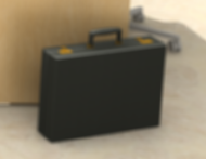
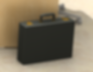
Exposure: is basically just like the Limited option but with a control for adjusting the exposure to make the image brighter. In the image to the left, the exposure has been increased to 1.75 (default is 1.00). If you prefer to spend some more time on inserting additional light sources and adjusting the light settings manually, this option may be more suitable for your renderings.
|
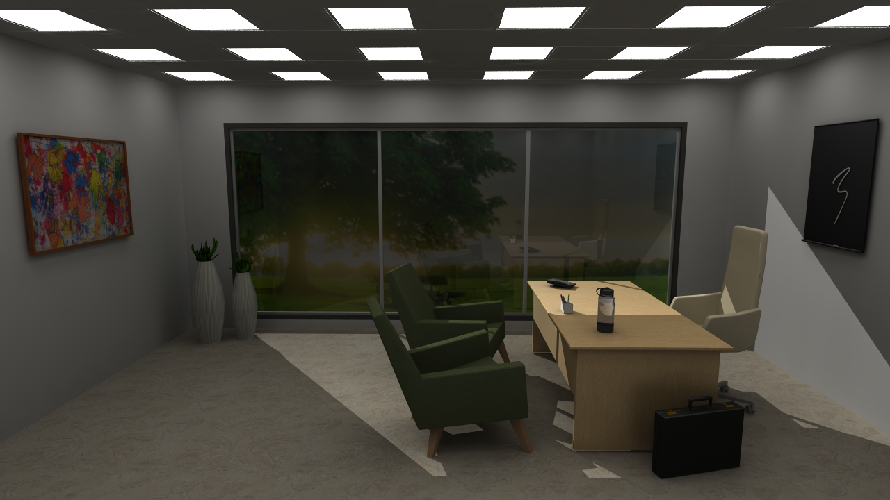
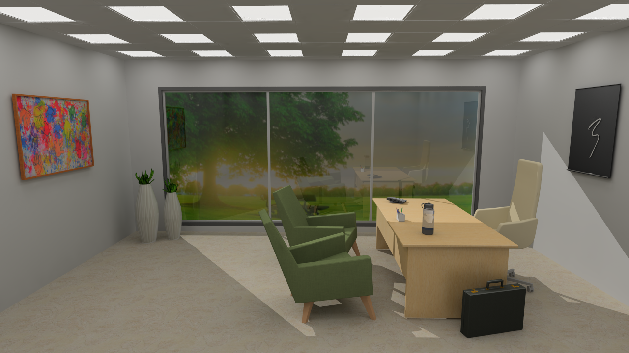
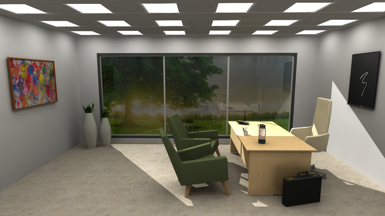
Below are two renderings from a drawing that contains a light source which causes clear overexposure. As this example shows, the overexposure is less prominent with the Photographic option, which is designed to correct and adjust the overall exposure in the image. The Exposure settings however is not, and therefore, the overexposure is more prominent in this image:
 |
 |
|
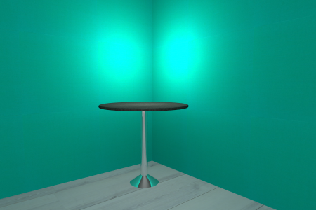
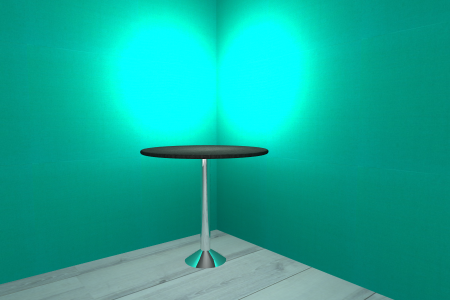
Keeping the Include background option selected will add a background for post processing, with the purpose of making anti-aliasing work better as it needs a background for smoothing out edges properly. This option is selected by default. Here are two examples of how the effect of this option:
 |
 |
|
The Brightness slider adjusts the overall brightness in the image, ranging from very dark on the left to very bright on the right.
The Contrast slider increases or decreases the contrast in the image, making objects in the image more or less distinguishable from other objects and the background.
Adjusting the Gamma slider affects the mid-range areas, but not the darkest or brightest areas, in an image and could enhance the sense of realism in the rendering.
Note that these controls are global, i.e. they affect the whole image and are not very nuanced.
 |
 |
 |
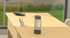
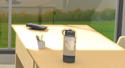
No adjusted brightness or contrast |
Brightness set to 20 |
Brightness and contrast set to 20, respectively |
These controls let you sharpen or blur your image, or apply a glow effect.
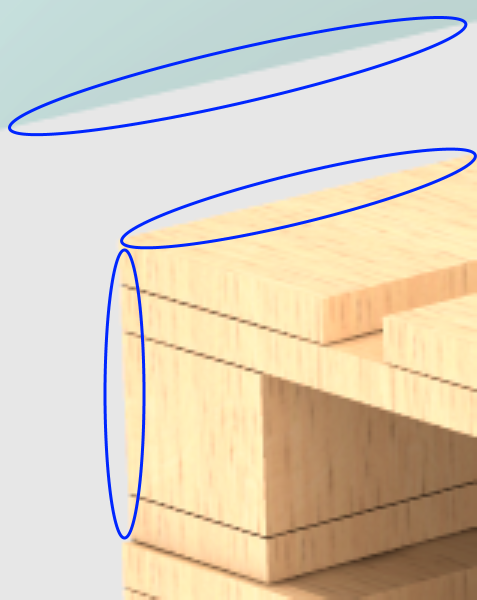
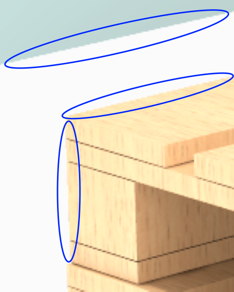
Sharpen: reinforces the lines in the image, making objects look sharper:
 |
 |
No sharpen effect |
Full sharpen effect |
 |
 |
No sharpen effect |
Full sharpen effect |
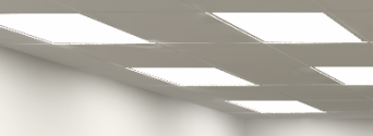
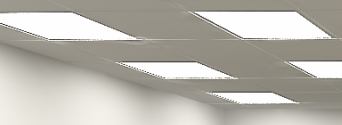
Blur: applies a blur effect to the image. Notice that the Radius control has a large impact here in terms of how much blur is applied. The minimum value (1) applies a very light blur, hardy even visible, while the maximum value (6) applies a really significant blur. The blur effect affects the whole image.
 |
 |
 |
No blur effect |
Full
blur effect and |
Full
blur effect and |
 |
 |
 |
No blur effect |
Full
blur effect and |
Full
blur effect and |
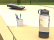
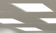
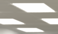
Glow: makes lit surfaces (such as tiles or table tops) even glossier as the light on them increases.
 |
 |
No glow effect |
Glow effect set to 80 |
The intensity curve is a graphical control for fine tuning the overall light intensity in the image. The leftmost column affects the darkest areas, the rightmost the brightest areas, and the two middle columns affect the mid-range areas. It starts out as neutral, with no intensity correction which is displayed as a diagonal line as shown below:
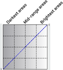
You can change the intensity by selecting one of the presets Brighten, Darken, Contrast, or Invert. These will have different effects on the image, and you will notice how the curve changes. You can left click on a control point to slightly adjust the curve, and if you left click anywhere along the curve you will add a new control point. If you make alterations, a dashed line show the neutral reference line. The reset button is for resetting to the selected preset. If you don’t want any intensity correction at all, pick the neutral option from the drop down menu again. You can also create custom curves simply by adding your own control points by left clicking along the curve, and adjusting them. To remove a control point from the curve, just right click on it.
You can also click the small arrows on the side of the grid to change the curve's start and end points.
Adjusting the white balance will change the color balance in your rendering; making it look warmer or cooler. The white balance is adjusted by clicking anywhere along the scale from amber through white to blue, until you are satisfied with the result.
 |
 |
White balance set to about halfway in the Cooler direction |
White balance set to about halfway in the Warmer direction |
You can make a rendering look softer or more intense by adjusting the color Hue, Saturation and Brightness. Just moving the sliders slightly can have a large impact on the colors and the atmosphere in the rendering. Moving the sliders more to the ends could help creating more artistic or exaggerated effects. Each slider can be reset back to its default value with the left arrow, while the Reset button resets all sliders at once.